For thirty years, Equity Engineering Group (E2G) has been an industry leader in providing specialized consulting services and software solutions to help the refining, petrochemical, and chemical industries manage risk, increase plant efficiency and maximize equipment availability while promoting people's safety, and reducing environmental impacts as well!
Project Overview
E2G was confronted with a modern-day challenge: their five customized windows products operated in silos, leading to limited capabilities to offer a unified solution and maximum value to their customers. To stay relevant and meet evolving customer expectations, E2G took the first step of migrating two products to the web, which now required an update to the UX and UI.
As a legacy consulting service provider, E2G initiated an organizational transformation towards becoming product and user-focused. The primary goal was to create a seamless user experience by rebuilding the product suite using agile and design thinking processes while bringing all the products into one cloud platform. E2G aimed to build and expand a product and design team to achieve this goal.
To kickstart the process, the company focused on revamping the Equity Engineering Cloud application and using that as a foundation for the rest of the products.
My Role
Director of Product Design & UX
Develop partnerships within the company to accelerate transformation and adoption of a user-centric culture.
Partner with product owners and key stakeholders to help align the business, product strategy, development, and user goals to ship products that continuously add value.
Build a design team, develop a roadmap, budget, and manage priorities.
Identify opportunities for new capabilities and methods to validate assumptions through various research methods.
Set best practices and standards related to UX/UI across products and features.
Present insights, concepts, and designs to internal and external stakeholders.
Provide guidance, coaching, and mentorship to members of the design team.
Challenges
Short timeline
No analytics to track quantitative data.
There was no feedback loop to gather user input.
Lacked a cohesive look, feel and experience.
Undefined process flows.
Understanding of the user's mental models and organizational structure.
Developing Cross functional communication
Discovery
Without the ability to review any analytics on product usage, the first step was to create a strategy. I partnered with my Lead Product Designer to define a research strategy and implement Google Analytics and Fullstory to track quantitative data to align with the qualitative research findings.
After gathering data from EEC, an engineering calculator library, and Practices, a regulatory library, my team shifted our focus to understanding the user's mental models around how they organize and approach their workflows.
Because Product Design was new to the organization, we took a straightforward and simple approach, utilizing the Double Diamond process for larger projects. We implemented design sprints for smaller projects with shorter timelines to ensure efficient and effective execution.
Competitive Analysis
We started by conducting a competitive analysis to better understanding the features and functionality the top competitors use. In addition, this analysis enabled us to gain valuable insight into the current expectations for the users and identify areas for opportunity.
BUilding Relationships
To build a relationship of trust and empathy, we needed to create a feedback loop to open lines of communication with our users. So, we partnered with our marketing team on messaging and frequency of interactions and launched a User Research Panel that allows users to sign up to get involved early and often in the design process.
A Survey was sent to all users to get better insight into who was using E2G Software and to identify who would be good candidates for an interview.
Interviews were conducted with internal and external stakeholders to validate our target audience and identify their journey to gain empathy around the structure of their day to determine where we could add value.
Nineteen stakeholders were interviewed, spending an hour with each. Based on the conversations, here are the key insights.
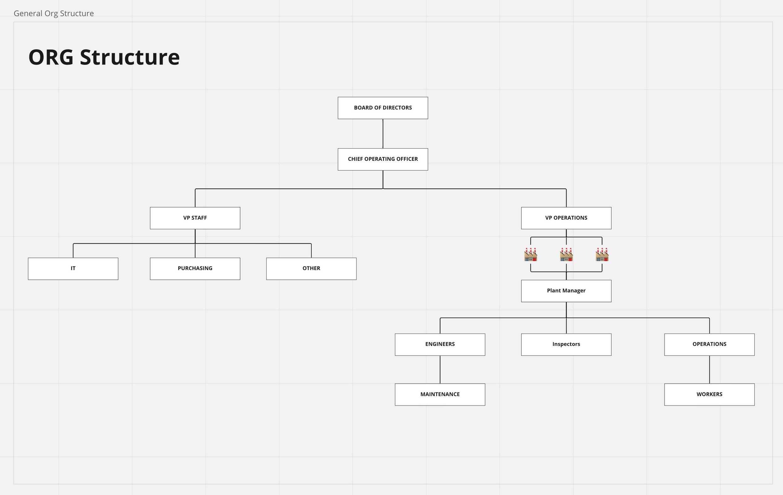
Interviews confirm a standard corporate structure.
Confirmed personas
Identified users needed a simplified solution
They organized their documents and maintenance schedule at the equipment level.
Users use the same calculators depending on their role and industry to perform their daily tasks.
A SUS Survey (System Usability Scale) was distributed to our user panel participants to get insight into the current EEC product's performance from a usability perspective. We had 11 responses.
Benefits of using SUS include:
A straightforward scale of 1 (strongly disagree) to 5 (strongly agree) to administer to participants.
It can be used on small sample sizes with reliable results
It can effectively differentiate between usable and unusable systems
In-person and remote Contextual Observations were used to gain more empathy for the needs and challenges E2Gs users currently face interacting with the products in a real-world setting.
Insights from research
E2G's core users are getting younger and used to modern software platforms and need a streamlined solution. With this shift comes a new set of needs and challenges that must be addressed to meet the user's expectations.
Needs:
Accurate and up-to-date information on oil and gas operations.
Efficient communication and collaboration between teams and stakeholders.
Data analysis and visualization tools to help with decision-making.
Mobile access to information and tools for remote workers.
Automated workflows to improve efficiency and reduce errors.
Integration with other systems and tools used in the industry.
Compliance with regulations and safety standards.
Robust security features to protect sensitive information.
Challenges:
Managing large amounts of data from various sources.
Dealing with complex equipment and machinery.
Operating in remote or harsh environments.
Ensuring safety and minimizing environmental impact.
Managing multiple projects and stakeholders simultaneously.
Keeping up with changes in technology and industry standards is hard.
Navigating complex regulatory and legal frameworks.
Defining A New Experience
With the initial discovery phase completed, it was time to unpack all the notes and define goals to significantly improve the UX of the EEC within 6 months. With such a short timeline, the team implement some Design Sprint methods to streamline our process and solve complex problems quickly.
During discovery, we identified that our customers had a similar corporate structure but had different taxonomy. As a result, we defined a structure that would scale to any of our client’s organizations. This solution would have to be flexible enough to allow for the different naming conventions.
We also discovered each level of the organization had different needs and goals for a system, but for this project, we focused on the user group that used the EEC product the most, the engineers. With that, we develop personas.
Defining our primary persona helped us understand what motivates them, what challenges they face, and how they interact with the product. we also used them as a communication tool to align stakeholders and ensure everyone on the team is working towards the same goal.
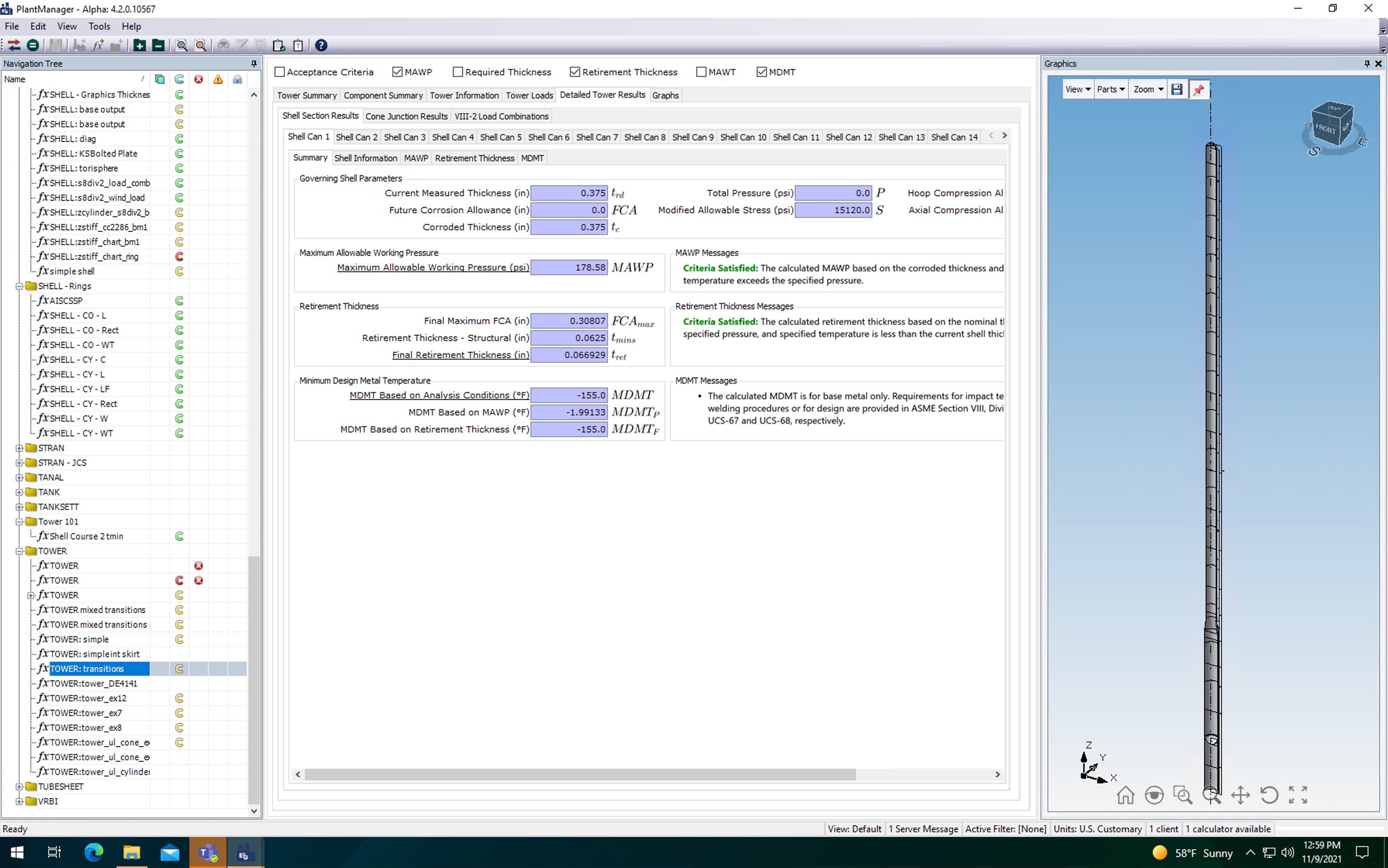
An audit of the current interface and experience was conducted to identify and align the Fullstory and Google Analytics findings.
We discovered that with around 100 different calculators available in 10 different categories, the current design needed more context and filtering options to help users find what they were looking for. But first, we needed to understand our user’s mental models around organizing the calculator. We performed a card-sorting exercise and conversation with our user panel to define and standard approach.
Next, we defined a set of product design principles to establish guidelines and best practices that would guide our design process and help align the organization in creating successful products moving forward. These principles define how a product should look, feel, and function, to create a positive user experience that meets the needs and expectations of the target audience.
Product design principles include:
Functional, Not Just Sleek - Aim to do both, but when confronted with an either/or choice, we prioritize being straightforward over visually appealing.
Smart, Not Just Easy - Ease of use is a baseline; we want to leverage our system's knowledge to help make decisions on behalf of the user when we can.
Reassurance, Not Just Communication - We can give the user lots of data, but our goal is to provide valuable context and reassurance when we deliver that information.
Systems, Not Just Instances- Each design component, sentence, screen, etc... is important, but thinking about it in relation to the larger design system is even more important.
Visual design principles include:
Bright backgrounds and whitespace - The use of whitespace make the interface look clean, fresh, and aesthetically pleasing.
Subtly rounded corners - Make the interface feel more organic and friendly.
Big, legible titles and headings - Help create hierarchy and makes it look more modern.
Color with meaning - Using color for important actions or elements to draw attention makes the UI more pleasurable.
Contrast is King - Helps define visual hierarchy.
Small illustrations to support - Icons help support context and make the UI feel welcoming and fun.
Overall, the principles aim to create a product that meets the user’s needs, achieves business goals, and delivers a positive user experience. Following these principles would allow my team to quickly design successful products that scale and were both functional and visually appealing.
Development
Taking everything we learned, it was time to create a design system to efficiently redesign the EEC product. Building a foundation for future products in the platform. Figma was used to create the design components, screens, page templates, prototypes, and Storybook to document the system and eventually provide code snippets to streamline the development process.
We named the Design System "Petra," short for petroleum, meaning rock in Greek, and "oleum," a Latin word meaning oil. Using Material Design as the foundation with an Atomic Design strategy, we partnered with the frontend Dev team to produce the code in React.
We started with sketching and a whiteboard session outlining tokens and components needed for the redesign.
Design System “Petra”
EEC ReDesign
Now that we had established a base design system, we could align our new experience with the data collected from FullStory and Google Analytics so that we were not designing in the dark.
The data showed that users needed help with finding the correct calculator. So we contacted users to dig deeper into their issues and identify that the current home screen was confusing and lacked context.
Because there was no way to filter the calculators, users were forced to scroll continuously. This was a pain point because, as we learned during discovery, the user used the same calculator to perform their jobs. So we introduced a flexible system to allow users to find a calculator by searching, filtering, and favoriting.
Task-based user testing along the way helped to iterate and evolve the design quickly.
Throughout the process, we made sure to involve the developers every step of the way to ensure they were up-to-date with my designs and to determine what was technically feasible.
The team held weekly meetings to highlight an area of the UI and have an open discussion.
Final Designs
A product tour was also created to highlight new features and functionality to our users.
Even though early rounds of user testing validated the new design direction, we needed to test further and dial in our designs to validate some assumptions and fill in some knowledge gaps so we could design the next-generation platform. So we partner with sales, marketing, and product leaders to educate and develop a go-to-market strategy. This involved a Beta phase.
Beta was launched in November of 2022 and is ongoing.
MOODBoards
Design a PlatForm
The valuable data we gathered throughout our discovery phase, together with the continuous quantitative study, helped define our product’s story.
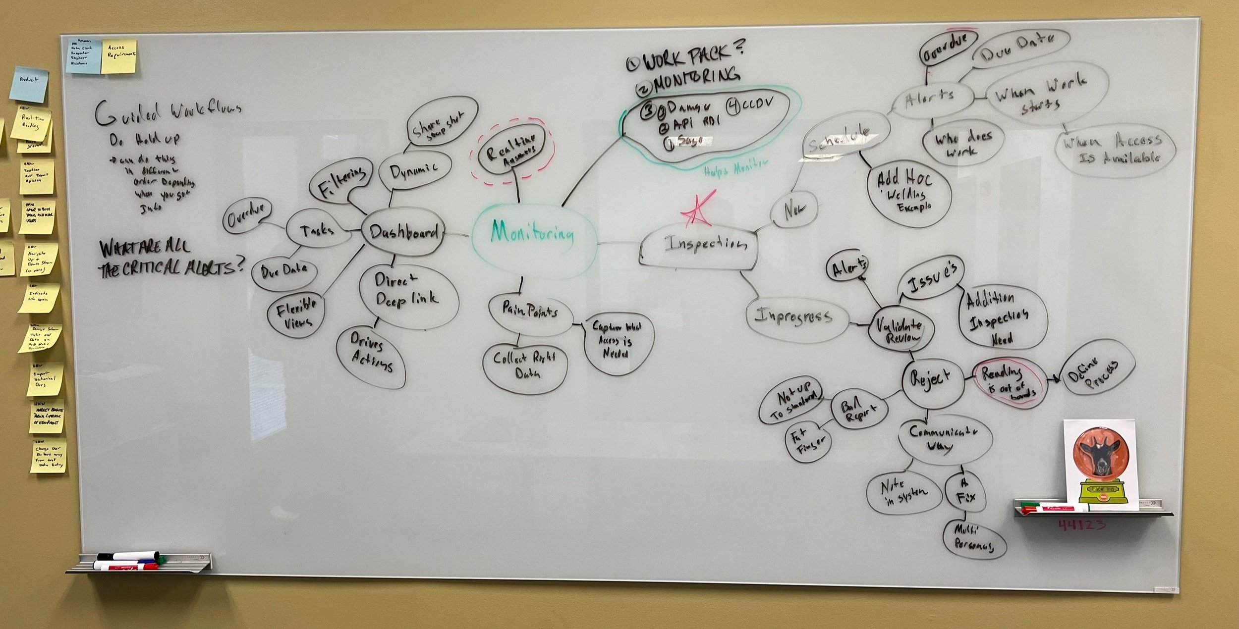
We planned workshops with stakeholders to mindmap and gain empathy around our customer’s journeys and make sure that our team was on the same page. We started with whiteboard brainstorming sessions and then captured our ideas in Miro. The goal was to prioritize our early concepts and identify opportunities for improvement.
During these workshops, we quickly realized there needed to be more internal knowledge about what a platform was. So we schedule lunch and learns to outline the strategy for what a platform needed.
Cloud-based architecture: Flexibility and convenience enables customers to access their software and data form anywhere.
Subscription-based of Token-based pricing: By offering subscription-based or token-based pricing models, customers can take advantage of innovative tech solutions while monthly or annual payments - unlocking a world of upsell and crosselling oppurtunities.
Multi-tenant architecture: SaaS platforms are designed to maximize efficiency. In a multi-tenant model, customers can share software and data resources without risk of duplication.
Automatic updates and maintenance: Customers benefit from knowing their software is always up-to-date.
Customizable and configurable: Allows users to transform their environment to fit their individual goals, customizing the user interface, and expanding capabilities with integrations.
Scalable and flexible: Customers can customize their solution to suit the changing needs of theri business.
Data security and privacy: It's critical to prioritize the security and privacy of customer data. This includes encrypting all sensitive information, storing securely in the cloud, and adhering to regulations like GDPR & CCPA for comprehensive protection.
Development
We analyzed various aspects of the user experience during our initial discovery phase and identified several pain points that were negatively affecting users. One of the significant issues we discovered was with our navigation. Due to an outdated tree structure that was being used for navigation and file organization, users were becoming confused and having difficulty navigating the system. This was a major concern because it affected the overall user experience and could lead to a decrease in user engagement and adoption of our platform.
As a result, we realized that we needed to address this issue as a top priority in order to provide our users with a smooth and seamless experience. We began brainstorming solutions to improve our navigation system right away.
As we dug deeper into our users' needs, it became clear that we needed to create a more personalized experience based on personas. A VP of Operations, for example, would be more concerned with the overall health of the organization and specific KPIs, whereas an inspector or maintenance worker would be more concerned with the tasks they needed to complete on a daily, weekly, or monthly basis. As a result, we developed a highly adaptable, role-based experience that catered to the specific needs of each user persona.
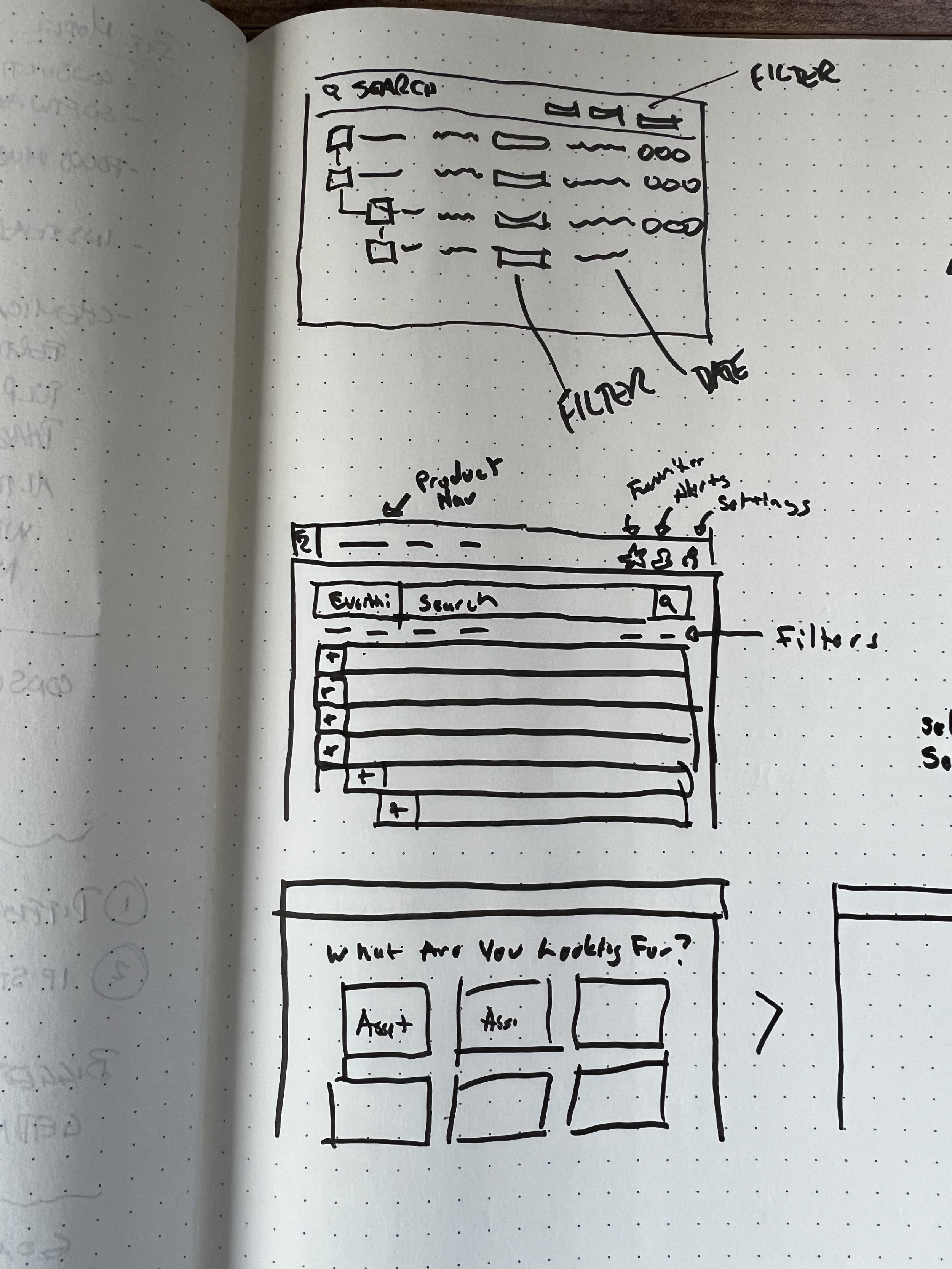
As an example, consider an Admin's Dashboard, which is in charge of managing team members. We discovered that finding relevant data was a significant challenge because everyone had different ideas about where and how to store information, resulting in multiple duplicate files. To address this issue, we decided to put in place a global search, dropdown, and facility map navigation system that would allow the administrator to quickly and easily locate the necessary data. This solution would not only save time but also reduce the possibility of errors due to multiple versions of the same file.
As part of our effort to streamline our data management process, we created a detailed equipment profile screen that would serve as a one-stop shop for all relevant data. This new approach would not only improve the overall organization of the user’s data but would allow them to avoid the hassle of searching for data in multiple locations, which would ultimately save time and improve efficiency.
Users would have quick and easy access to information such as maintenance history, repair records, service schedules, and other critical data points.
Results:
The leadership team embraced these ideas, and we went on to create a comprehensive 3 and 5 year roadmap. This project is still ongoing and evolving.


